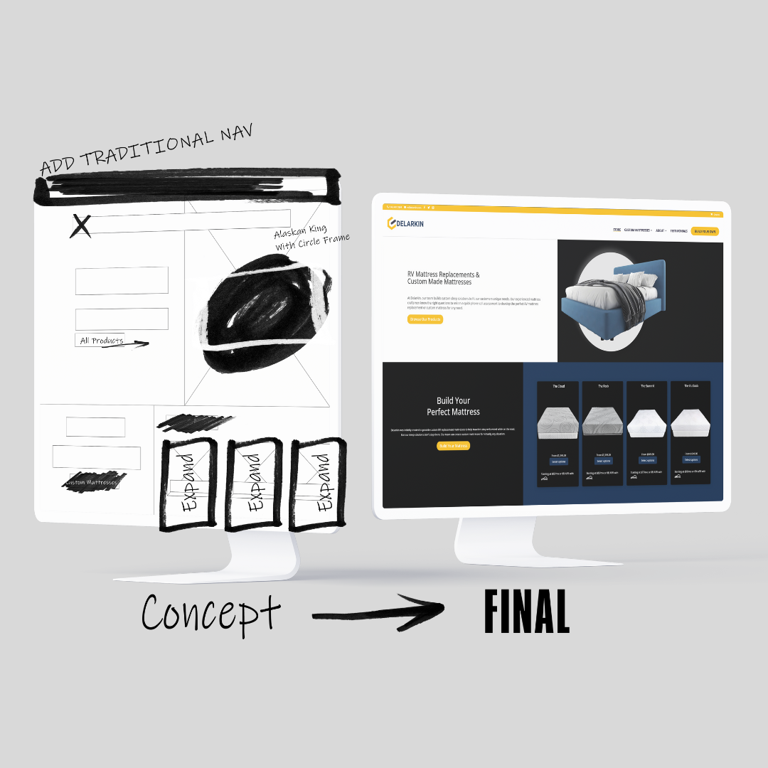
With a digital overhaul, WiT Group elevated Delarkin’s online presence by reshaping how users approach shopping for RV mattress replacements and oversized mattresses online. Our website development services are committed to delivering practical solutions that enable our marketing efforts to have a bigger impact. In the case of Delarkin, our team initiated a comprehensive transformation of Delarkin’s digital storefront without requiring a complete website rebuild. This project could be categorized as a “reskin” or website redesign. Still, several improvements to the site’s functionality and information architecture resulted in an improved user experience and conversion rates for this eCommerce website.
A unique challenge was the wide range of the target audience and the need for a superior mobile and tablet experience for on-the-go customers. These issues required a thorough analysis to simplify the user journey and address common user confusion when navigating the website. In taking on this project, WiT Group and Delarkin’s aligned focus was the customer. Ensuring a straightforward and user-friendly online experience for Delarkin’s visitors was vital to strategically positioning the brand for e-commerce success.


Delarkin’s Homepage Upgrade
Our early design changes revolved around placing products front and center. The homepage was transformed, highlighting the diverse range of mattresses Delarkin offers. By prioritizing product visibility, the redesigned homepage has become a powerful tool for capturing customer interest right from the first click.
Pushing Main Products to the Homepage
The homepage serves as a virtual storefront, and WiT Group recognized its potential to drive sales. By placing four top-performing products just outside of the fold on the homepage, Delarkin’s offerings became instantly showcased. This bold move captures visitor attention and streamlines the user experience, increasing the likelihood of conversions.
One of the primary challenges Delarkin faced was user confusion while navigating the website. We identified this issue as a roadblock and implemented strategies to simplify the user experience. This was achieved through thoughtful redesigns focused on intuitive navigation and clear pathways.

Visual Updates Aligned with SEO Standards
Our team understands the significance of both aesthetics and search engine optimization (SEO). In our visual update, we refreshed the look of Delarkin’s website and incorporated elements strategically aligned with SEO standards. This involved optimizing the site’s structure, enhancing meta tags, and refining content for improved search engine visibility.
This dual approach aimed to breathe new life into Delarkin’s online platform, ensuring it boasts an eye-catching design. Simultaneously, the strategy aimed to secure a higher ranking on search result pages, enhancing Delarkin’s overall online presence.
Adding Personalization
Fully Customizable Mattresses
Built-in Sales Rep Interaction
We integrated a seamless connection with a sales representative into the website to enhance the customer journey. The custom mattress feature connects users with knowledgeable sales professionals who can guide them through customization, answer inquiries, and provide personalized recommendations. This personalized touch adds a human element to the digital shopping experience, fostering trust and loyalty.
WiT Group’s redesign of Delarkin’s website is a comprehensive strategy of visual improvements. Our team strategically addresses user confusion, aligns visuals with SEO standards, highlights key products, and introduces innovative customization features. The revamped website actively engages customers, meeting their unique needs.
Brittany Degnan
Author

Need Help With Your Digital Marketing?
Related Articles
Side-by-Side CRM Comparisons
When evaluating CRM platforms, it's important to assess the specific needs and goals of your business. Whether you're looking for powerful automation, seamless integrations, or just an easy-to-use interface, selecting the best CRM platform depends on your specific...
Google Ads Success Stories
Google Ads has become an indispensable tool for businesses aiming to expand their online presence and boost sales. These real success stories from various clients in various industries highlight the power of Google Ads in driving tangible results. From startups and...
How Google Measures Search Quality
Google, the leading search engine, handles billions of searches every day. However, many marketers, business owners, and advertisers wonder how Google delivers useful, high-quality search results. The answer lies in Google's various methods, including user surveys,...
Stay Up to Date With The Latest News & Updates
Join Our Newsletter
Stay up to date with the latest news and marketing tips!


Recent Comments