Good calls-to-action (CTAs) can be the determining factor in convincing users to convert and take action. In the words of Eric Ries, author of The Lean Startup, effective CTA button design is arguably one of the most important, yet often undervalued disciplines in web design.
Crafting a Compelling CTA Design
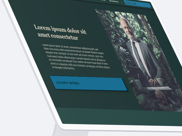
Maximizing the effectiveness of your CTA requires careful consideration of its design. Utilizing bright colors and contrasting them against the background is crucial to making your CTA stand out and drive clicks. By applying simple-to-read serif fonts, your users can quickly understand what action they need to take. Lastly, limiting the CTA copy to only a few words is key to conveying the core message and destination of the button in a concise manner.
Adding Color to CTA Buttons
Choosing the right color for your CTA buttons is a critical element of CTA design. To maximize the effectiveness of your CTA buttons, it’s best to use a single, bold color that captures the user’s attention in order to distinguish it from other elements on the page. It’s important to avoid colors that blend in with your brand’s established color palette as the colors may fail to capture the user’s attention. Avoid using a gradient color scheme with two or more hues as it may cause visual distractions and result in difficulty in readability. If you’re unsure about which color to use for your CTA buttons, it’s always better to use bright and vivid colors that can be easily identified by users to entice them to click.
According to recent studies, CTA buttons that include vibrant orange hues are the most impactful, producing up to 34% more clicks than counterparts that use blue or green colors. It’s imperative that CTA buttons always exhibit a contrasting hue from the surrounding elements to prompt users to identify and click on them.
Enhancing CTA Buttons with Visual Indicators
Apart from utilizing bright colors, CTA buttons must also contain visual indicators that grab the user’s attention and guide them toward the desired action. By integrating such visuals, like arrows or icons (e.g., “play” icon for videos or “info” icon for product pages), into CTA buttons, users can quickly determine which button they need to click to accomplish their objective.
Aside from focusing on CTA design, hover states can also be leveraged to aid in achieving higher clicks and conversions. CTA hover state is a feature that triggers a color or size change in a CTA button when the user hovers their mouse over it. This draws attention to the CTA button and inspires users to click on it. Research indicates that the inclusion of CTA hover states can boost clicks by up to 50% in contrast to CTA buttons that lack hover states. To optimize the results, the hover state should use vibrant colors that contrast against the CTA button’s background color. Additionally, it’s necessary to limit the use of hover states and restrict them only to CTA buttons on a page. Implementing too many hover states outside of CTA buttons may result in visual confusion and harm the effectiveness of CTAs.
Designing CTA Button Size and Shape
Research indicates that the most effective shapes for CTA buttons are either round or rectangular, with a width-to-height ratio of 1:1. It’s crucial to avoid making them too large as this may make them overwhelming for users. Ideally, CTA buttons should occupy no more than 1/3 of the page’s width to maximize their effectiveness. Additionally, providing ample padding around the CTA buttons enhances their visibility and ease of clickability.
How to Make Mobile-Friendly CTA Buttons
To optimize CTA buttons for mobile devices and ensure their visibility, it’s important to keep the CTA copy short and limit the button size. An ideal length for CTA copy on mobile is three words or fewer since longer CTAs can appear cluttered on smaller screens and pose readability challenges for users. Furthermore, designers should aim to use larger CTA buttons whenever possible, with an optimal button size range varying between 44px and 88px, ensuring ease of clickability on touchscreen devices.
Maximizing conversions is heavily reliant on CTA design. To achieve desirable results, designers must incorporate CTA buttons with bright and lively colors, integrate visual cues to captivate attention, optimal shapes, and sizes, and must be mobile-friendly. Adhering to these guidelines will amplify CTA button effectiveness, consequently driving conversions.
Devoting the necessary time to designing CTA buttons that focus on delivering maximum user engagement can bring tremendous value for increasing conversions. A well-crafted CTA design strategy can empower CTA buttons to be a formidable tool in driving conversions and generating increased ROI. The right CTA design formula can ensure that users promptly comprehend the CTA and feel motivated to click, thus improving conversions.


Need Help With Your Digital Marketing?
Maximize Impact with CTA Button Placement
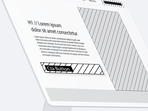
To capture the attention of potential customers and encourage them to take action on your website, the placement of your CTA buttons is crucial. It’s important to position CTAs in areas of the page that indicate a desire or intention to take action. Effective CTA placement strategies include placing buttons at the end of a portion of text, following headlines and descriptions, or beside images that feature CTA copy. Additionally, placing CTAs at the top of a page, even in the navigation bar, ensures that users see it as soon as they land on the page and that it remains in view as they scroll down. Testing and experimenting with different CTA placements is essential for optimizing the performance of your website. By placing well-designed and strategically placed CTAs in prominent areas of your page, you can effectively boost conversion rates and drive more conversions for your business.
Persistent Placement of CTAs
Strategic placement of your call-to-action (CTA) buttons is highly important, as this can greatly influence user engagement and website conversion rates. To be more effective, CTA buttons should be placed in a “fold-and-a-half” of each other to ensure even spacing. This strategy places significant CTA buttons in an optimal location that boosts visibility and encourages users to take immediate action without the need to scroll down, leading to higher conversion rates.
Strategic Placement of CTAs
CTAs should be placed strategically near content that speaks about the value or execution of a topic, not necessarily in the heart of an educational segment of an article or service page on a website. Omnipresent and top of page CTAs aside, the CTA button placement should follow value propositions within the content itself.
CTAs for Mobile Sites
Designing CTA buttons on mobile sites can be challenging due to smaller screen sizes and inconsistent CTA placement. However, there are several strategies you can employ to ensure that CTA buttons are consistently visible on mobile devices. One method is to place CTA buttons in the website header or footer, ensuring that they remain in view as users scroll through the site. CTA buttons should also be placed strategically on key pages such as product and services pages—preferably above the fold and with ample padding around them to make sure they stand out. For optimal results, CTA copy must be direct and concise – with at most three words to avoid cluttering the page.
Analyzing CTA Performance
Effectively analyzing call-to-action (CTA) performance is essential in driving conversions. Analytics tools like Google Analytics, as well as other third-party analytics tools, can help you track your CTA performance and unveil insights that inform your CTA design and placement decisions. For instance, analyzing CTA performance data can help you identify which CTA buttons generate the most clicks and conversions, enabling you to fine-tune and adjust your CTA placement when needed. Additionally, reviewing CTA heatmaps and user recordings provides insights into how users are navigating and interacting with CTA buttons on your website, guiding decisions on CTA button placement optimization. Tracking A/B testing results is another effective way to fine-tune CTA design and placement. With this method, you can test different CTA variations and determine which leads to better click-through rates and conversion rates. By tracking CTA performance data, you optimize your website’s CTAs to meet user needs, leading to increased conversion rates. Ultimately, data-driven optimizations of CTA button designs and placement can pave the way to success and better user engagement.
In conclusion, CTA buttons are a vital aspect of any website, ensuring that visitors can take specific actions to accomplish their tasks or goals. To increase their effectiveness in driving conversions, they must be well-positioned throughout the webpage, with mobile optimization being a top priority. Regular CTA performance monitoring and analysis, facilitated by the use of analytics tools, are needed to optimize the CTA placement locations and refine CTA design, leading to the best possible conversion rates. By applying well-thought-out CTA placement and optimization techniques, you can guarantee that your CTAs will drive user engagement, conversions, and ultimately, business growth.

Need Help With Your Digital Marketing?
Related Articles
Side-by-Side CRM Comparisons
When evaluating CRM platforms, it's important to assess the specific needs and goals of your business. Whether you're looking for powerful automation, seamless integrations, or just an easy-to-use interface, selecting the best CRM platform depends on your specific...
Google Ads Success Stories
Google Ads has become an indispensable tool for businesses aiming to expand their online presence and boost sales. These real success stories from various clients in various industries highlight the power of Google Ads in driving tangible results. From startups and...
How Google Measures Search Quality
Google, the leading search engine, handles billions of searches every day. However, many marketers, business owners, and advertisers wonder how Google delivers useful, high-quality search results. The answer lies in Google's various methods, including user surveys,...
Stay Up to Date With The Latest News & Updates
Join Our Newsletter
Stay up to date with the latest news and marketing tips!


Recent Comments