A:M Internal Advertising
Rebranding Case Study
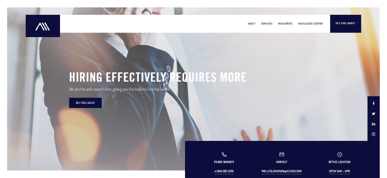
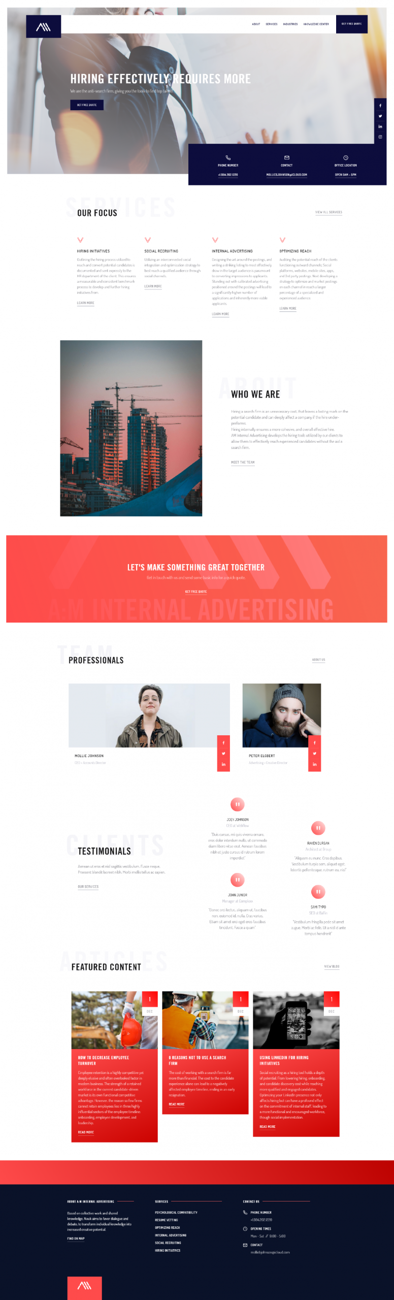
A:M Internal Advertising develops hiring tools used by companies to allow them to efficiently reach the experienced top of the line candidates without the aid or cost of a search firm.

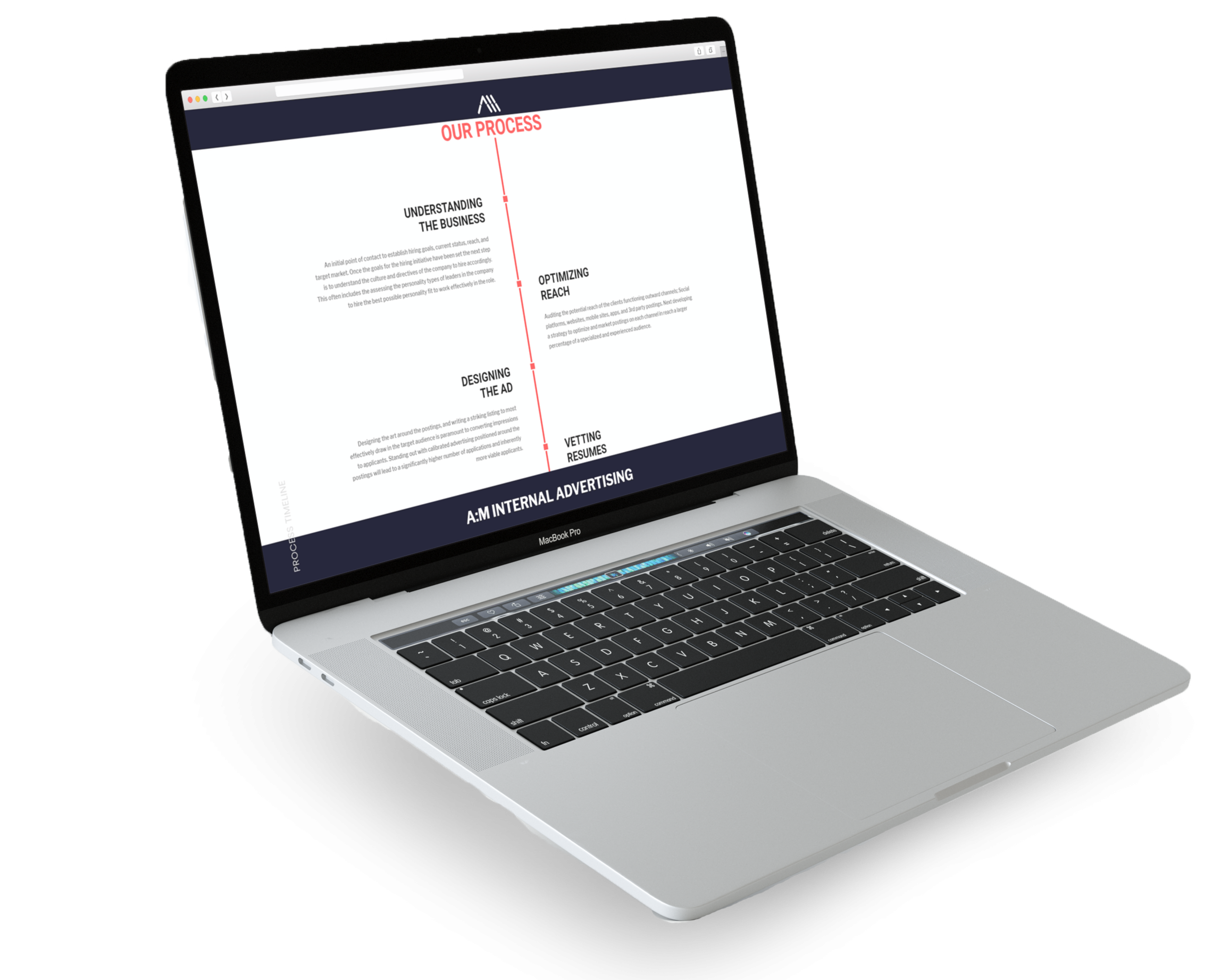
Our Process
Problem
A local Charlotte start-up, entering the highly competitive recruiting field. The brand differed however by utilizing social media optimization to help companies find highly specialized potential hires through the clients own social media accounts, creating a fully cohesive experience for the hire, in comparison to the segmented candidate experience with a traditional recruiting firm. The brand however lacked a logo or website that effectively reflected the ingenuity of the company’s functional strategy.
Objective
- Design a modern logo to differentiate A:M Internal Advertising
- Develop a website that aligns with the new contemporary company branding.


Strategy
The new A:M Internal Advertising logo pulls from the iconic look of digital clock numbers. The brand story that defined the logo elaborated on what it takes to be a strong professional, in today’s market, being well-read, motivated, passionate, and focused. But every strong candidate and commendable professionals day start early to the sound of an alarm clock. Thus the logo was cemented in the look of a retro digital clock. The art direction also differed heavily from the often sterile look of other recruiting firms.
Results