4TekGear
WEB DESIGN / UX / UI / Social Media Marketing / Content Development / CRO
Navigation, UX, and CRO Case Study
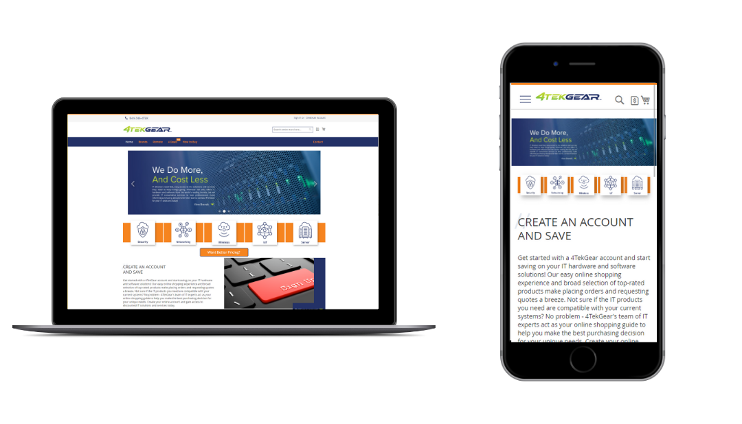
4TekGear is a company that offers advanced technology solutions to improve user experiences and simplify complex processes. They needed a website that would turn their growing audience into loyal customers. To do this, we designed a user-friendly (UX/UI) website that highlighted their reliability and encouraged users to engage and convert. Our focus on simplicity proved to be more effective than overly complex designs.
Scroll to View Gallery
Our Process
Problem
After COVID-19 made remote work more common, 4TekGear saw a big increase in website traffic. However, the problem was that the site wasn’t turning enough of those visitors into paying customers. Despite the high number of visitors, the conversion rate was too low. Adding to the challenge was the need to use a rigid framework for the website, which restricted design options and made it hard to improve performance.
Objective
- Redefine the 4TekGear website’s requirements for success, focusing on:
- User experience
- Conversion rate
- Brand-driven engagement
- Develop a high-functioning design that integrates seamlessly with the client’s existing content management system (CMS), which imposes additional design and development constraints
Strategy
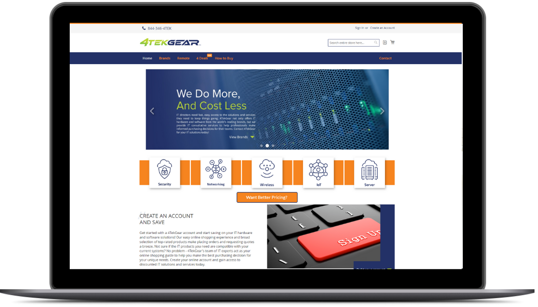
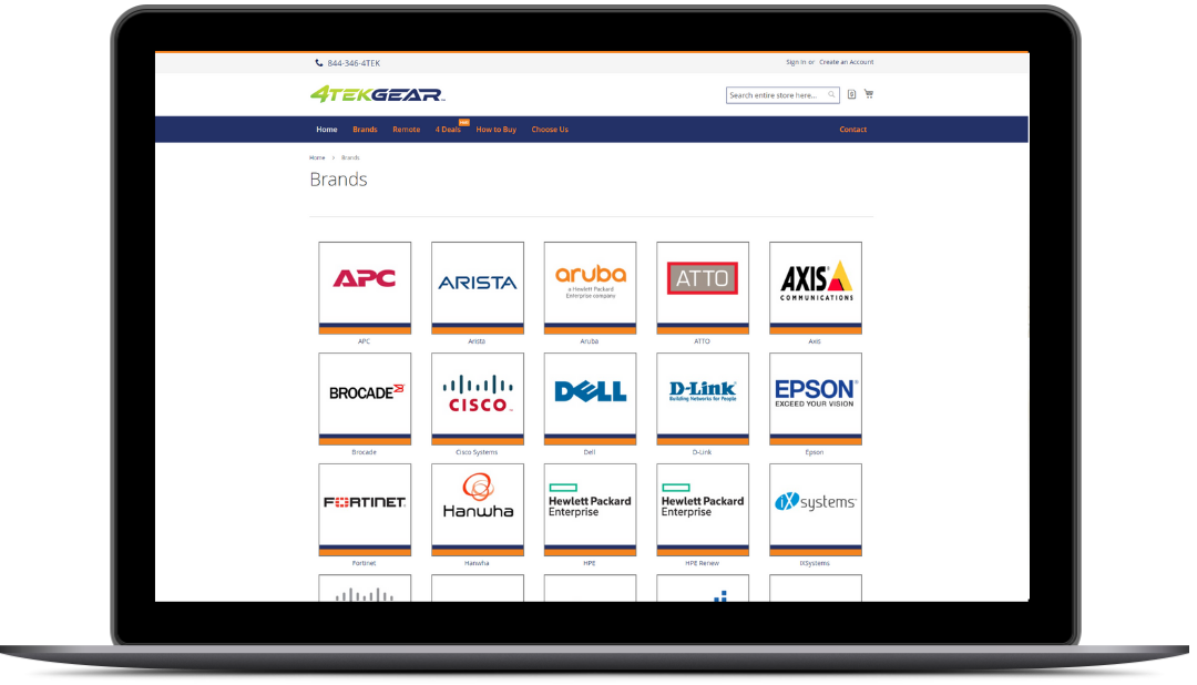
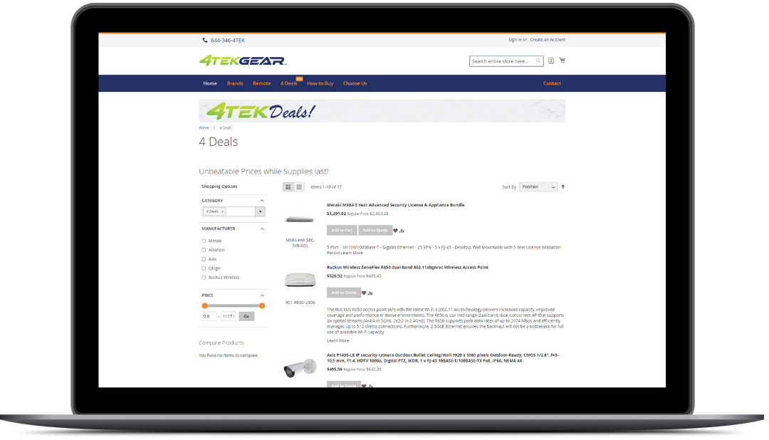
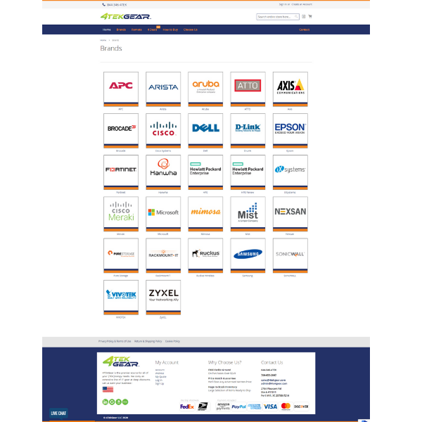
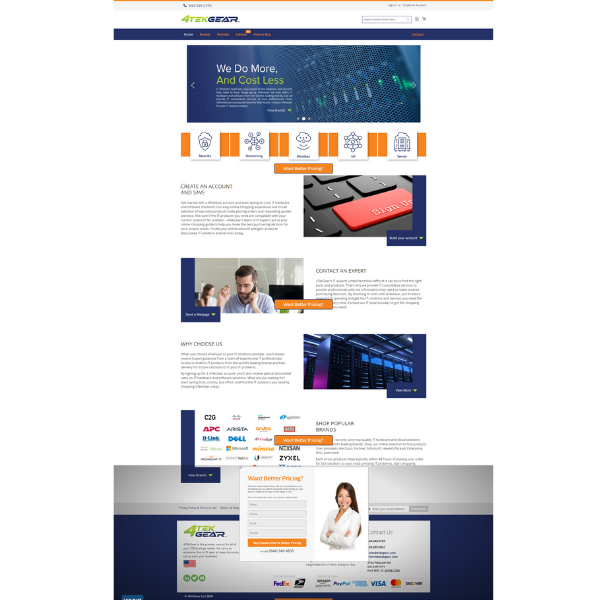
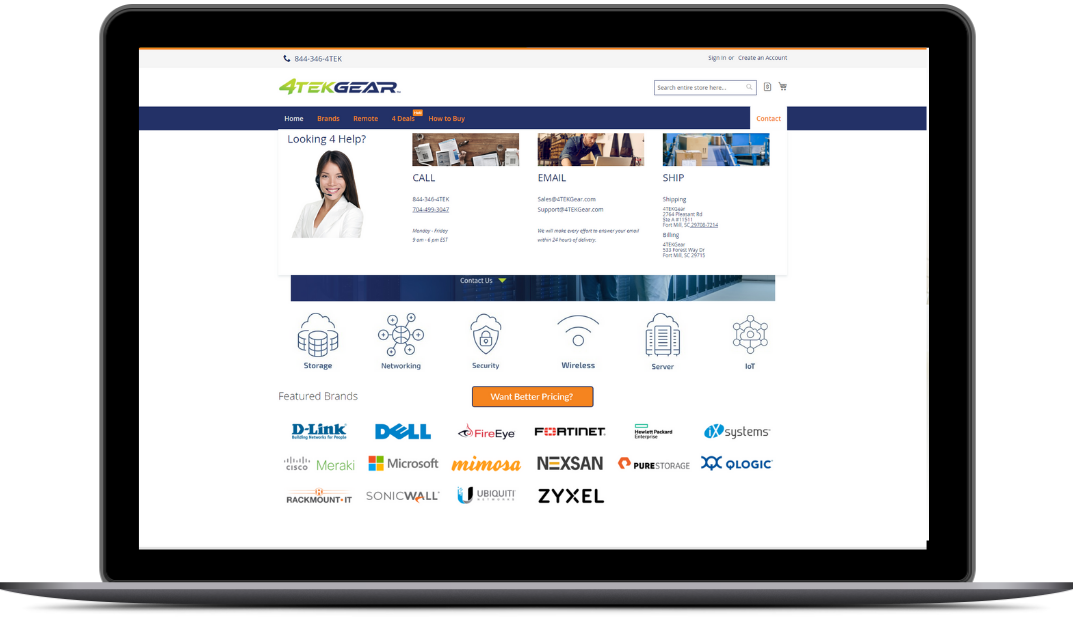
The first step was to make all of the vital pages accessible to users within an instant of landing on the home page of the website. These key pages were defined quickly into the process and deemed as essential to what is featured on the brand’s new homepage. Finally, a design template that was compatible with the preexisting framework would be applied to the home page and primary pages of the website, including product page layouts.
Results
The project made 4TekGear’s website more user-friendly and engaging by improving navigation and accessibility to essential pages. The new design, tailored to fit seamlessly within the existing content management system, enhanced both the site’s functionality and visual appeal. This optimization led to increased user engagement, strengthened brand consistency, and higher conversion rates, effectively boosting the site’s performance and user satisfaction.
Optimized Homepage Navigation
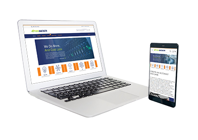
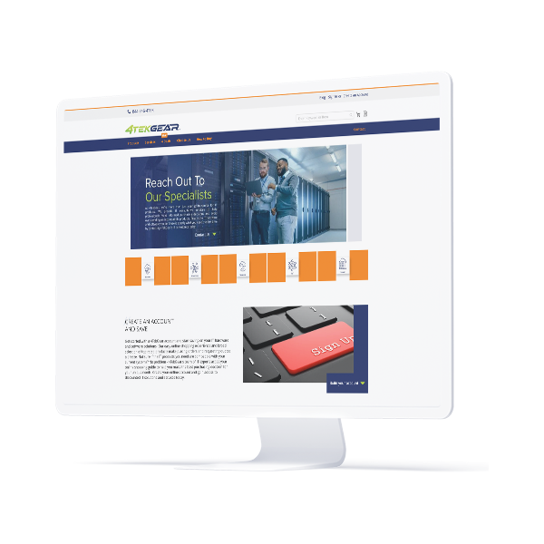
We began by enhancing the website’s navigation to ensure that key pages were instantly accessible from the homepage. By identifying and prioritizing essential pages, we streamlined user access to important content right from their arrival. This strategic improvement aimed to boost user engagement and facilitate a more effective path to conversion.
Adapted Design for CMS
We then integrated a design template that was compatible with the existing content management system (CMS). By working within the CMS’s limitations, we created a visually appealing and functional design that adhered to the system’s framework. This adaptation ensured that the new design was both practical and aligned with the client’s established infrastructure.
Enhanced User Journey and Brand Consistency
Our approach also focused on refining the overall user journey and reinforcing brand consistency. We optimized site navigation to provide a smoother experience and maintained a cohesive visual identity across the website. This alignment with the brand’s image helped strengthen recognition and delivered a unified and engaging user experience throughout the site.
